Subtotal $0.00


Email :134
Using bold colors is an exciting way to inject energy and personality into your surroundings, whether in home décor or fashion. But, as thrilling as they are, it can be challenging to know when and how to use them effectively. How do you strike the right balance between making a statement and overwhelming the space or outfit? This guide will help you understand the nuances of using loud, attention-grabbing colors in a way that feels thoughtful and stylish.
What Are Bold Colors?
Bold or loud colors are those with intense, vibrant hues designed to evoke strong emotional reactions. These colors are attention-grabbing and often seen in environments where visibility is important, such as in traffic signs, emergency vehicles, and roadwork equipment. Their purpose is clear: to attract the eye and deliver a sense of urgency or alertness. For example, the neon-yellow of a fire truck ensures that it is immediately noticed, triggering an instinctual response of caution or awareness.
Popular Bold Colors
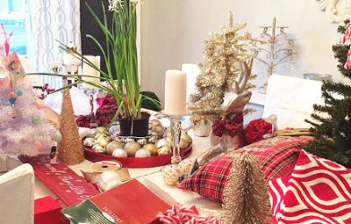
Bright and bold colors have made their mark on the fashion and design world for decades. In the late 1980s and early 1990s, neon shades were everywhere, from clothing to furniture, offering a stark contrast to the earth tones that had previously dominated. Colors like neon greens, oranges, reds, pinks, and blues became iconic, often associated with high energy and fun.
These days, loud colors still hold a place in design, though they are used more selectively. Examples of these vivid hues include any high-saturation versions of oranges, reds, yellows, and certain greens or blues. Neon lights are often used to describe the glowing effect of some of these colors, which are particularly noticeable in dim or dark settings.
The Importance of Restraint
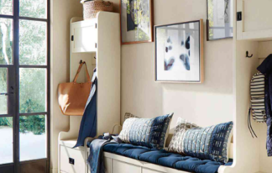
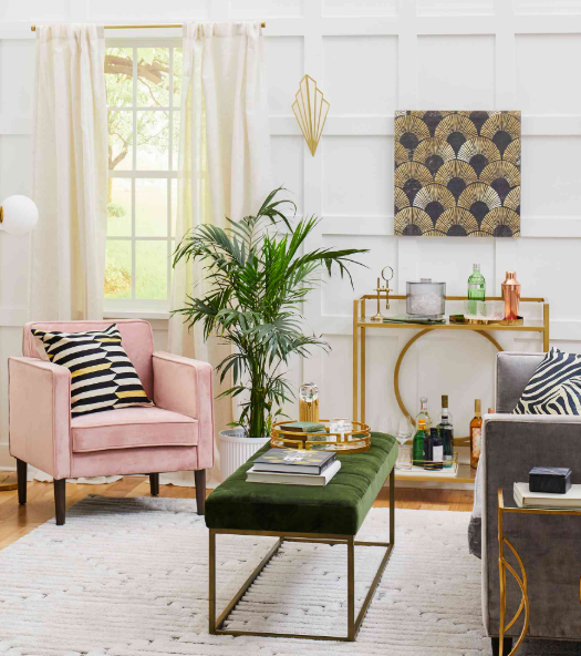
While bold colors can make a dramatic impact, they need to be used in moderation to prevent overwhelming a space or outfit. An interior designer or fashion stylist will tell you that the key to successfully incorporating loud colors is balance. Bold hues can easily dominate their environment, so it’s crucial to pair them with softer, more neutral tones to maintain harmony.
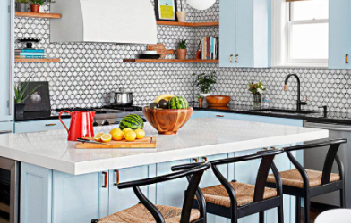
For example, a bright red accent in a kitchen can make the space feel lively and welcoming, but it’s essential to balance this intensity with more neutral elements, such as white cabinets. This ensures that the bright color doesn’t overpower the space but instead adds an exciting pop. A single bright red knob or a statement door painted in an unexpected shade can transform a space without taking away from its overall tranquility.
Using Bold Colors in Fashion
In fashion, loud colors can also shine, but the same rules apply. Pairing a bright top, like a hot pink blouse, with something more neutral, like a black skirt, allows the bright color to stand out while creating a balanced look. Bright red pants are another example of a bold fashion statement; when paired with a softer top, the color combination becomes both daring and stylish. By focusing on one key bold item and pairing it with more subdued pieces, you can create an outfit that feels balanced and vibrant at the same time.
Striking the Right Balance
As the saying goes, “With great power comes great responsibility.” This holds true for bold colors. While they have the potential to energize a space or outfit, restraint is crucial to achieving a tasteful result. I often advise using one bold color as the focal point and letting it take center stage. Whether you opt for neon-like shades or more subtle, saturated colors, pairing them with a neutral palette ensures that they remain the highlight without overwhelming the overall design.
If you’re looking to add a bit of excitement to your home or wardrobe, bold colors might just be the answer. They have the power to transform a room or outfit from ordinary to extraordinary, but with careful consideration, you can ensure they are used in a way that feels intentional and stylish.
Do you have any stories of how bold colors have worked wonders in your space or wardrobe? I’d love to hear your experiences and insights!